2026
JOURNAL
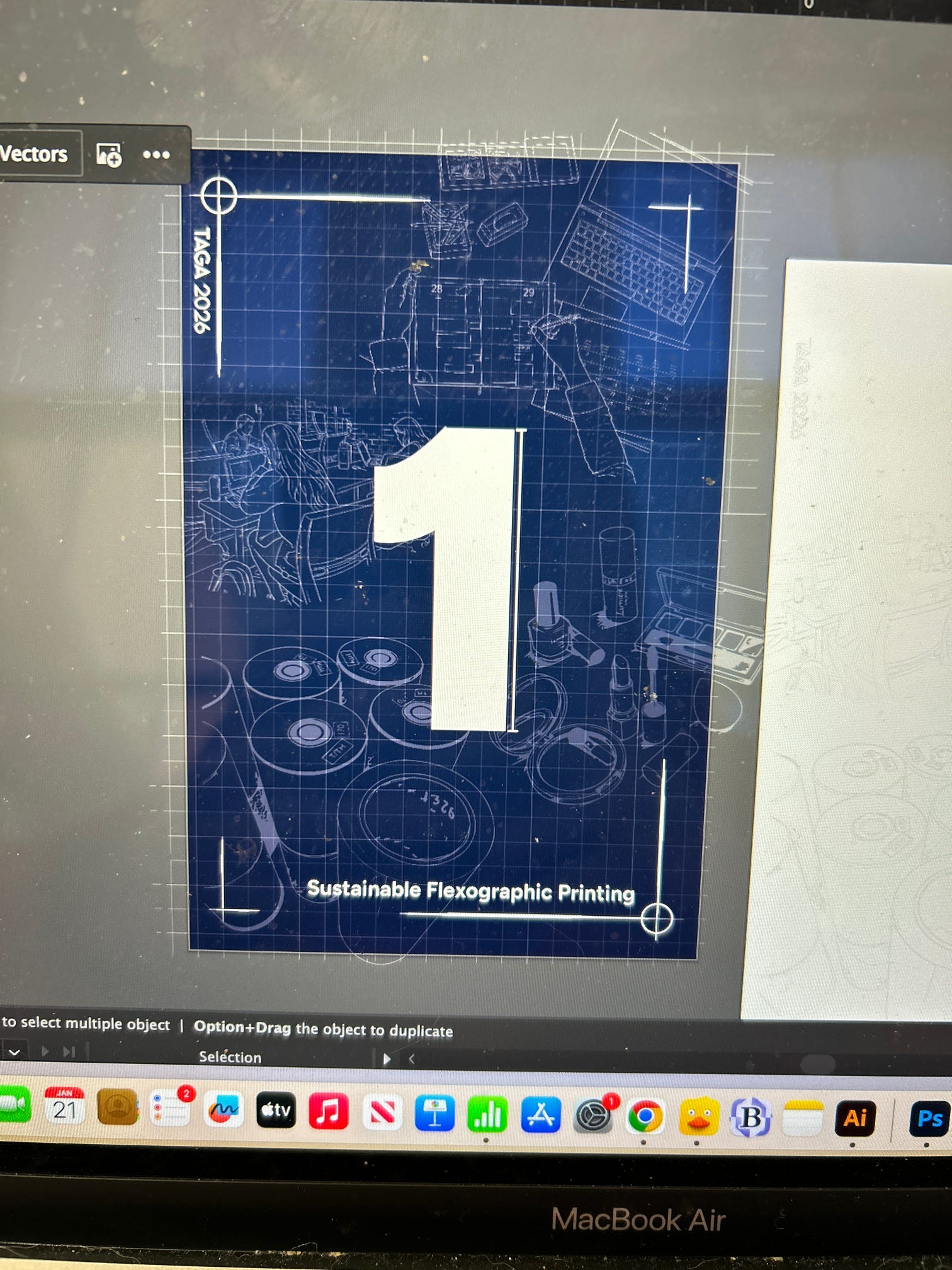
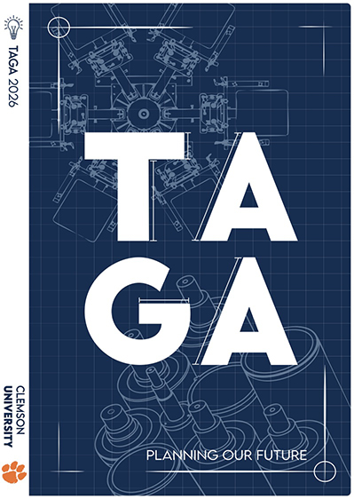
Blueprint sketch of carousel press

ENTRY DETAILS

Explore our four categories of creative work for the 2026 journal. Each entry showcases innovation, technical skill, and artistic vision from our chapter members.

JOURNAL PRODUCTION

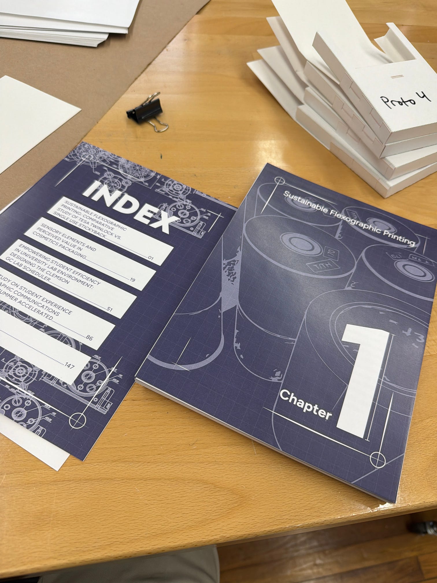
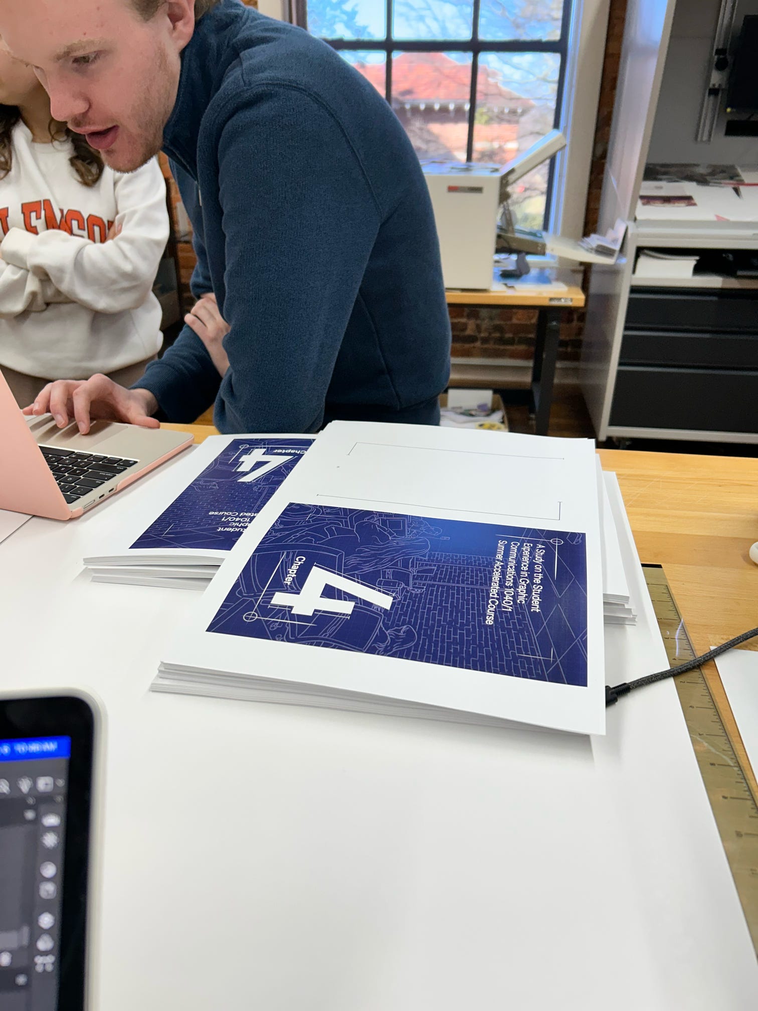
The goal for the TAGA Journal was to create a replicable workflow that includes design, printing, cutting, binding, trimming, and cover application. By combining durable materials such as Billerud 24 Point CrownBoard Prestige and Cougar Digital Copy Paper, students were able to create a product similar to what is produced in industry. Upperclassman who have prior experience in printing in commercial applications were able to share their knowledge with new TAGA members to build a sense of community and collaboration.

About This Entry

For journal production, interior pages are output on 11" x 17" Cougar Digital Lightweight stock using a Konica Minolta Accurio Press configured for booklet imposition, then trimmed using a Polar 78 Guillotine, organized and QC'd to ensure proper page order and orientation. Book stacks are assembled and adhesive-bound with a Fastbind system to form a clean, secure spine before being precision-trimmed to final size. Covers are produced separately on 24 Point CrownBoard Presitge with flatbed inkjet printing, digital cut and creased on a Zünd cutter, and attached to the stack using a final adhesive binding. The process concludes with comprehensive quality control to confirm alignment, adhesion, and dimensional accuracy.

PACKAGE DESIGN

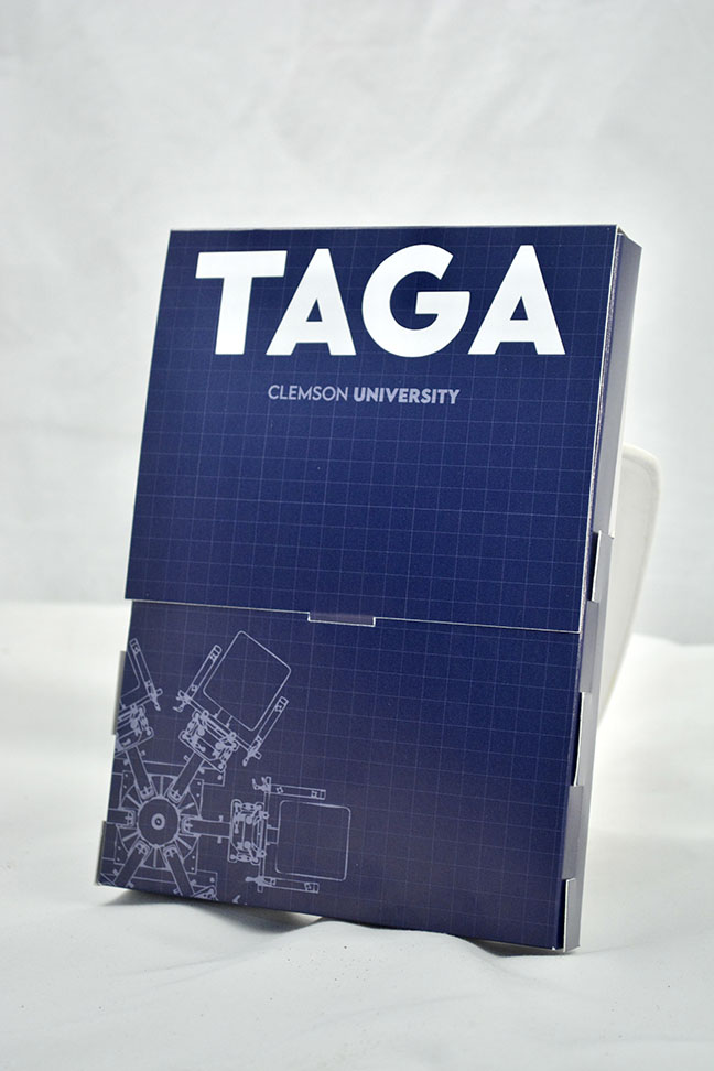
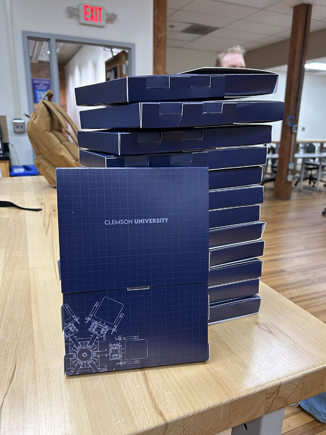
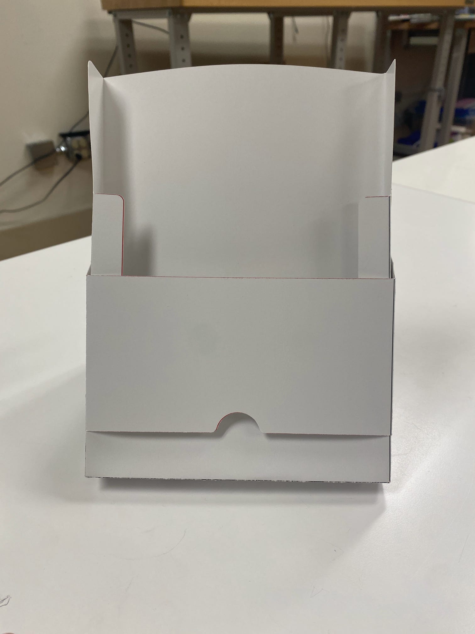
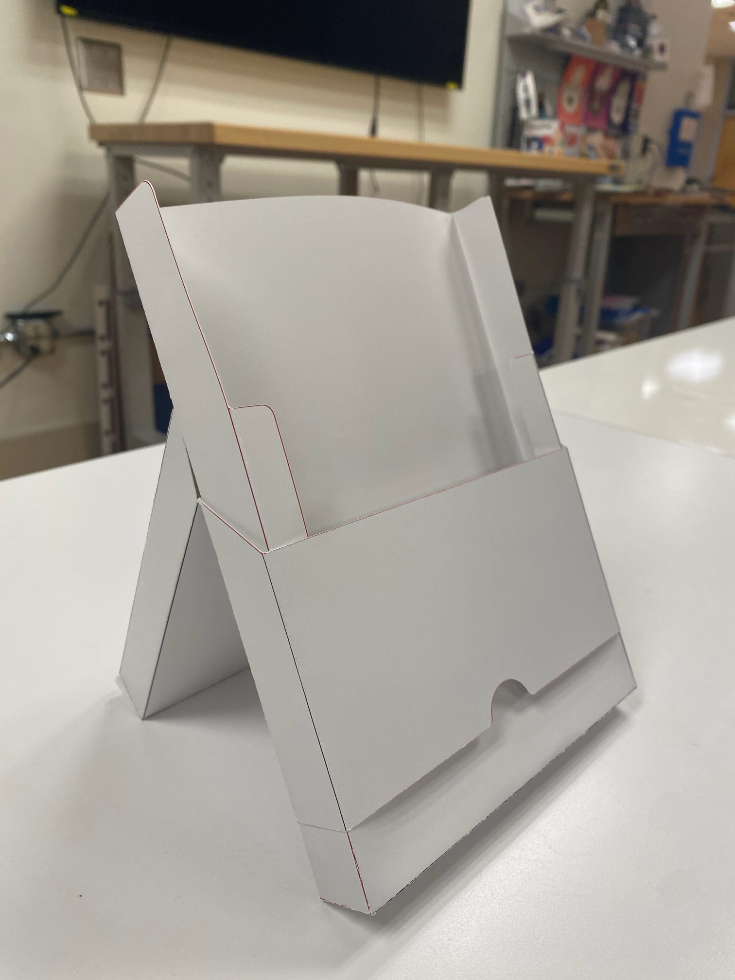
Our package design entry showcases innovative approaches to structural and visual design. The goal throughout the design process was to create a package that protects the journal, maintains visual consistency across entries, and offers unique functionality. We incorporated the same design principles that define our "blueprint" visual identity, a thin line grid system and carousel press graphic, to create a cohesive product. The dieline we created in Illustrator allows the package to fold into a stand. This dual function provides both protection and display functionality for the journal.

Production Process

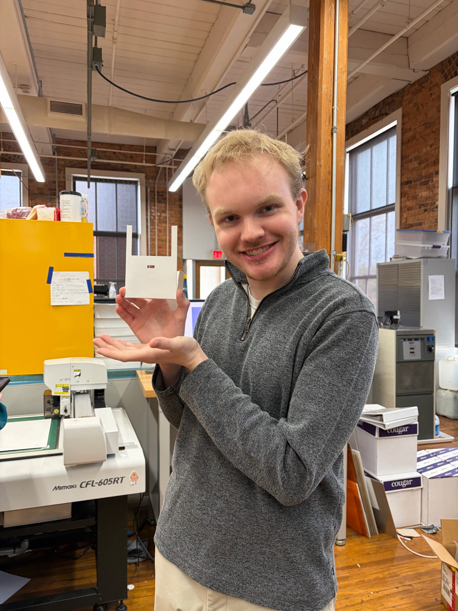
During the prototyping stage, our team ran into a few challenges with alignment and overall functionality. These issues were resolved through iterative design and testing. We printed and assembled the design at the Sonoco Institute of Packaging. The logo, which was printed on a Cricut, was applied to the final product, adding dimension and texture.

T-SHIRT DESIGN

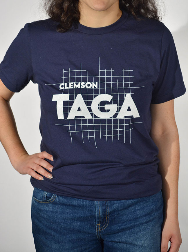
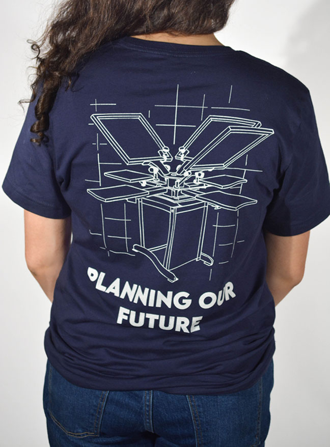
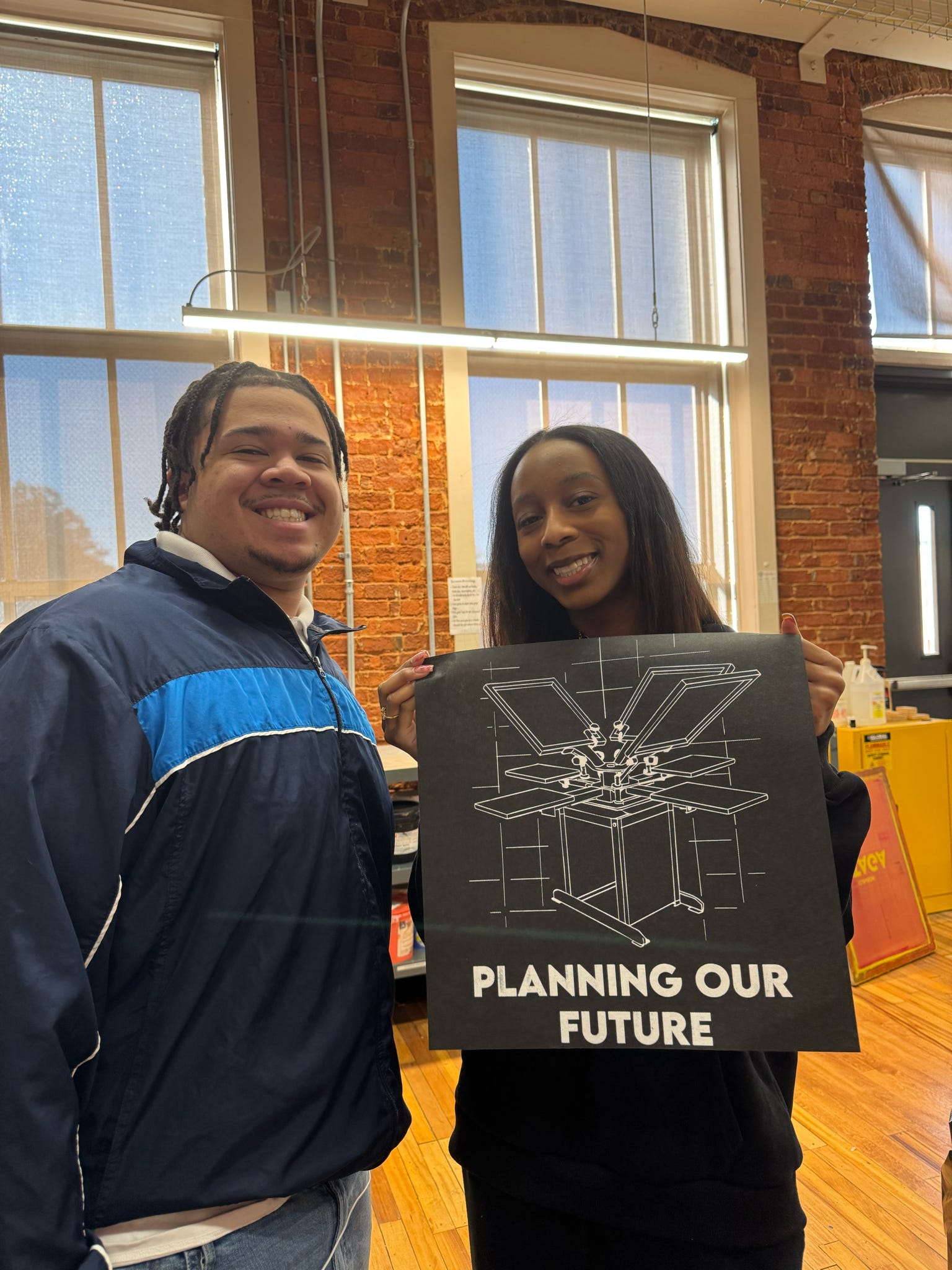
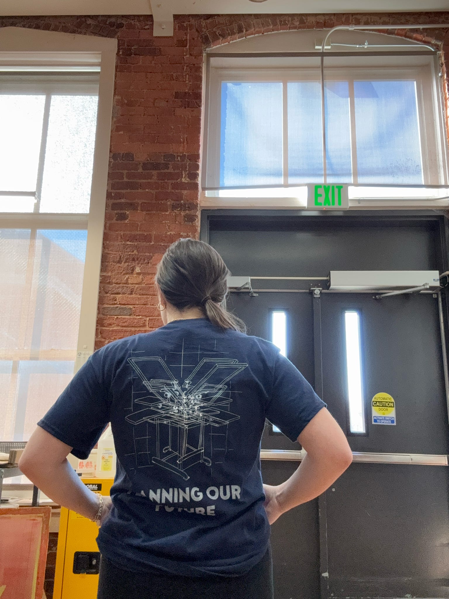
Our T-shirt design is a bold yet cohesive extension of our journal's visual identiy. Throughout the design process, our goal was to translate the structured "blueprint" aesthetic inot a wearable format. On the front, bold typography is paired with thin lines to create a strong contrast. The back showcases a detailed line art illustration of a carousel press, connecting the garment to its production process.

Production Process

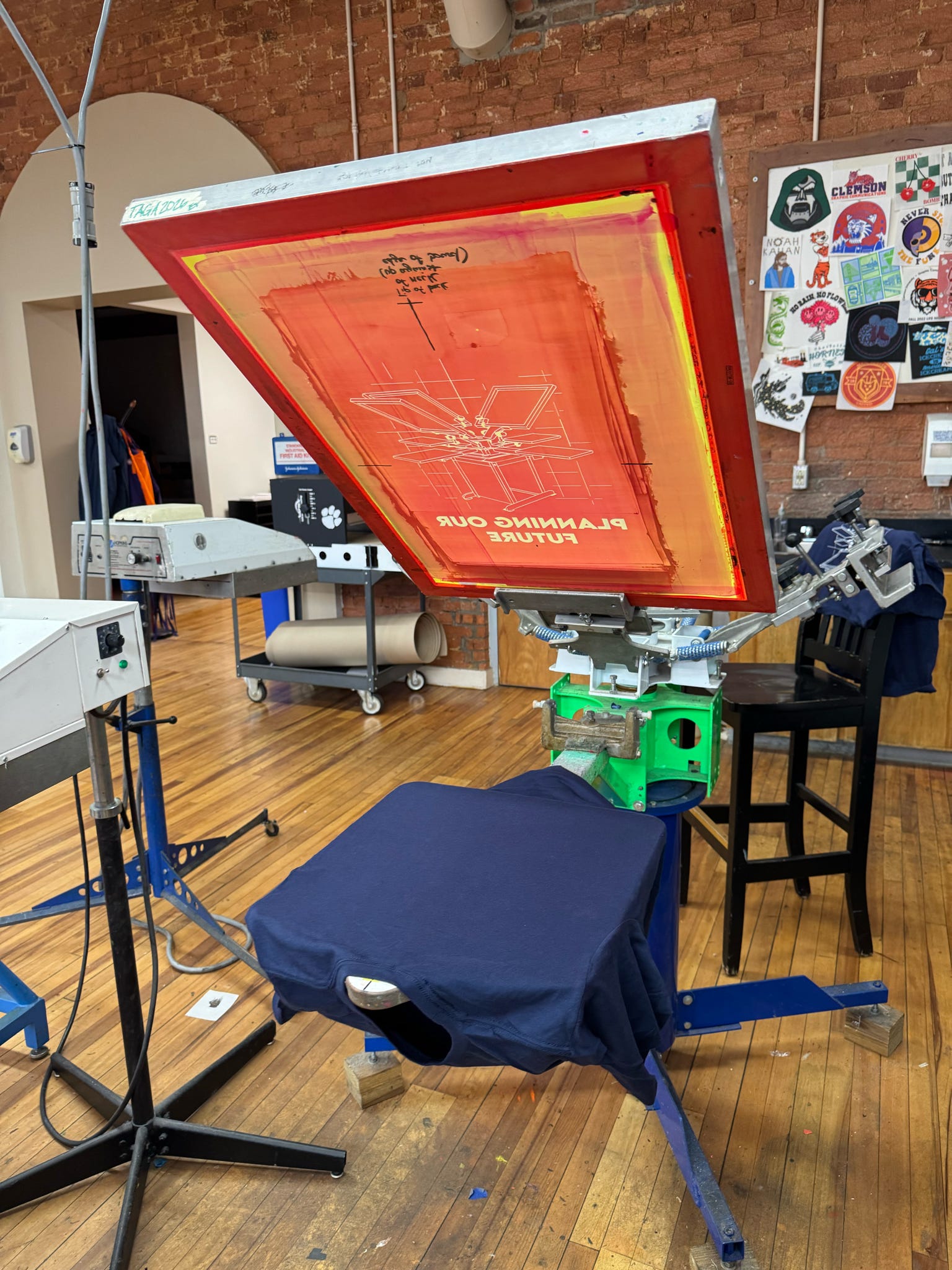
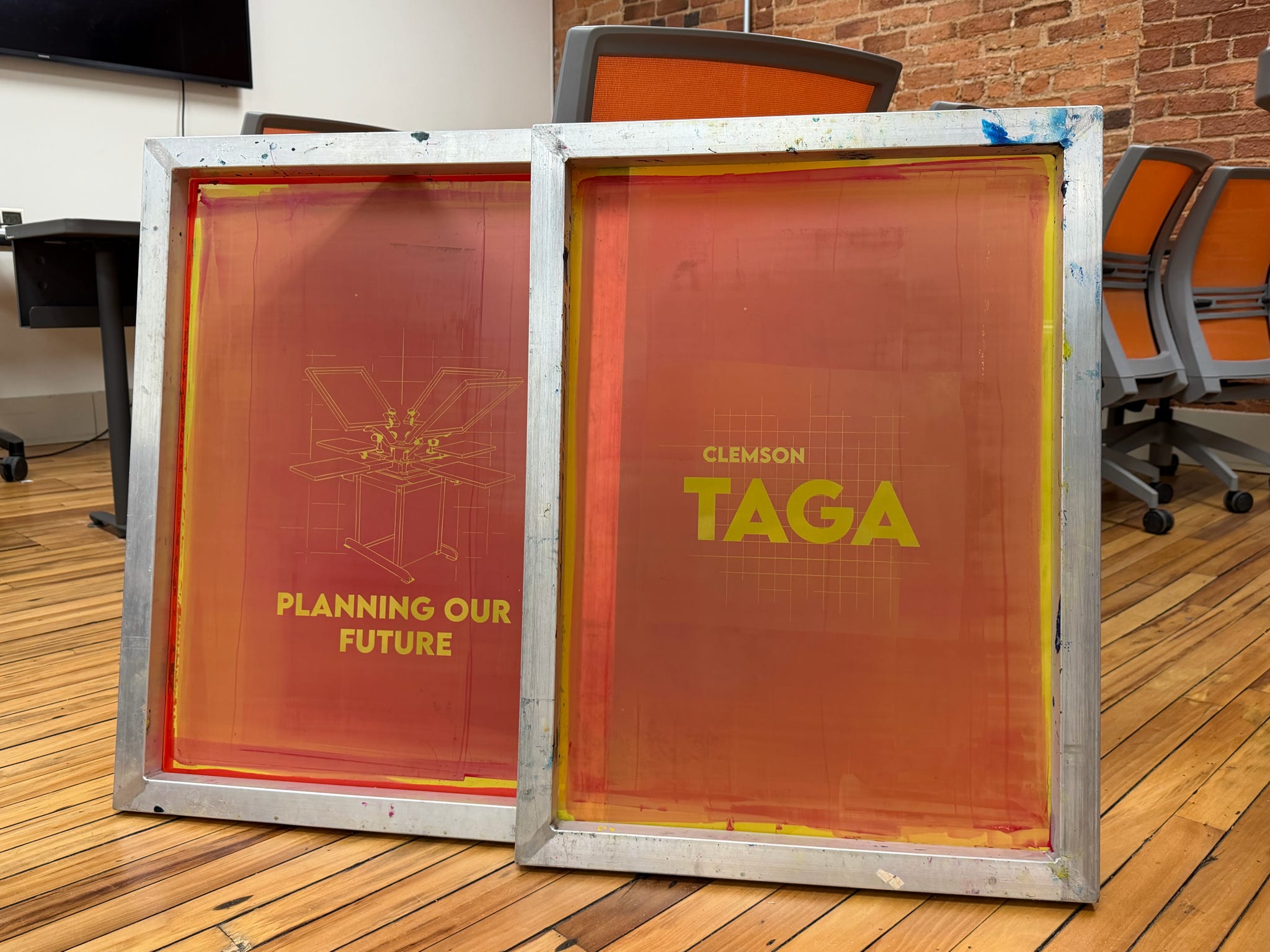
To produce the T-shirts, we utlized traditional screen printing. This included digital design, coating and exposing screens, aligning artwork, and testing different mesh count and line per inch (LPI) settings to ensure consistent ink flow and detail reproduction. One of the primary challenges was successfully printing the thin lines - applying neough pressure for opacity without causing ink to bleed. Printing with white ink on a navy substrate also required experimentation, leading us to print two layers of white ink to maximize contrast.

WEB DESIGN

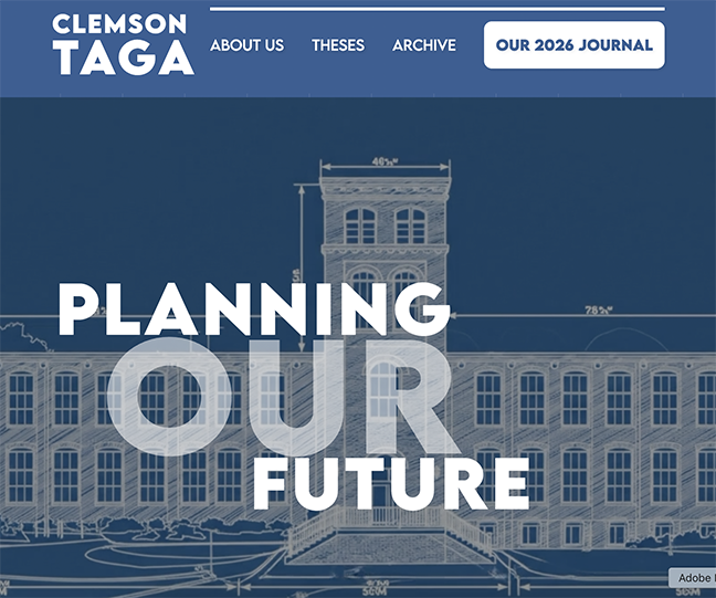
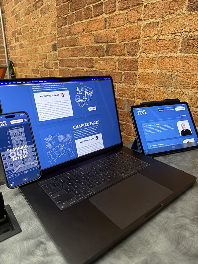
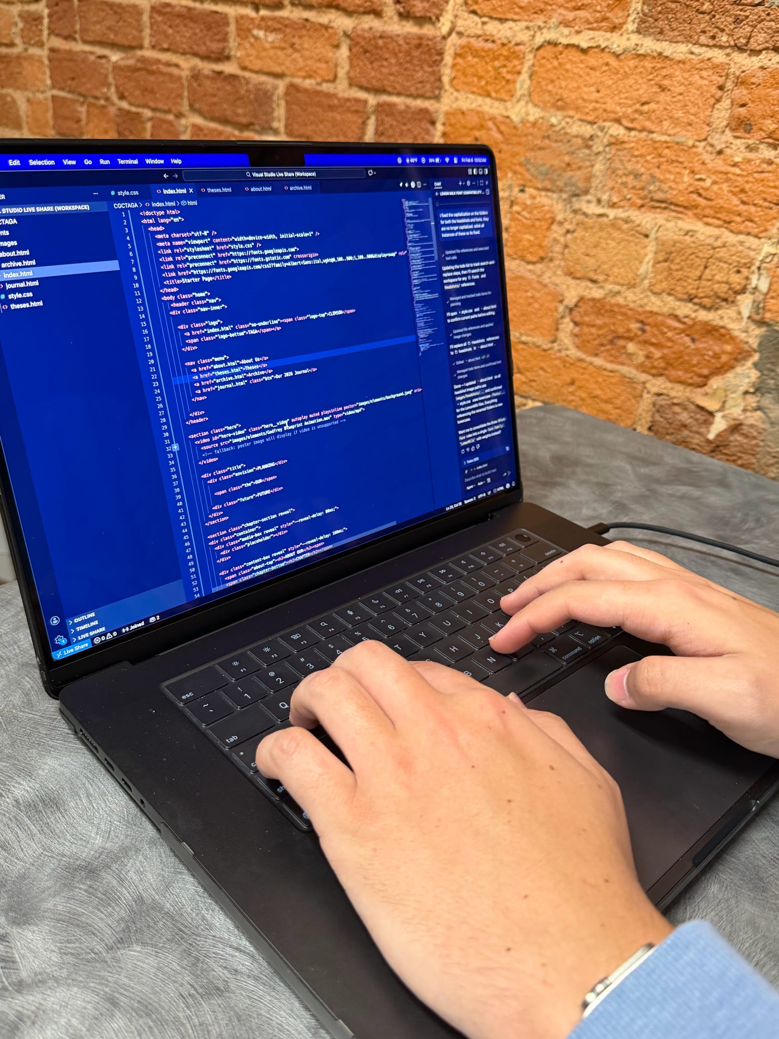
Our website design entry demonstrates a seamless translation of our journal's visual identity into an immersive digital experience. Hand-coded by our team using Visual Studio Code, the site showcases responsive design, creative layouts, interactive elements, and adhereence to accessibility standards. Throughout the design process, our goal was to merge strong visual design with user experience principles to create a digital experience optimized for desktop, tablet, and mobile viewing.

About This Entry

The project began with configuring detailed wireframes for each page in Figma, mapping layout structure, navigation flow, and content hierarchy. From there, we built the foundational HTML structure, establishing global navigation, headers, footers, and primary content sections to ensure consistency across the site. Once the framework was in place, we developed the CSS styling—defining typography hierarchy, color usage, spacing systems, grid structures, buttons, content cards, and section dividers to reinforce the blueprint aesthetic. We then integrated interactive components such as hover states, animated transitions, and collapsible content areas to enhance engagement and usability. To ensure reliability and performance, we conducted cross-browser testing and responsive checks, refining the site to maintain consistent functionality and accessibility across platforms.

INTERACTIVE ELEMENT

Our interactive element entry features a student-led virtual tour of Godfrey Hall, home to Clemson University's Graphic Communications department. Designed to immerse viewers in the printing environment, the experience showcases our state-of-the-art technology while providing valuable insight for prospective students, alumni, and industry partners. To maximize accessibility and engagement, the interactive tour is housed within a QR code printed on the package design.

About This Entry

The production process began with scripting and planning key messaging. We then collected B-roll footage and filmed guided segments throughout the facility to capture the functionality of the space. The video was shot on a mobile phone in ProRes Log format in HD at 30 frames per second, providing quality control in post-production. During editiing, we refined pacing, color graded, and incorporated lower-thirds titles to clearly identify locations and speakers. The final interactive element delivers an engaging and professional digital experience that complements our other entries.